THE GOODS
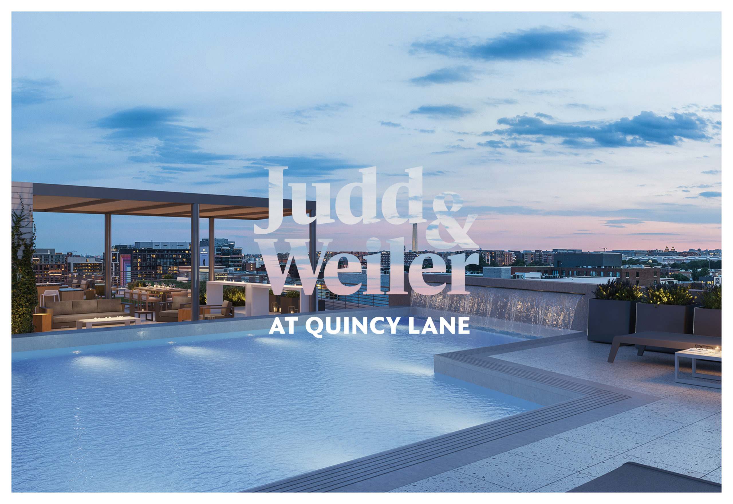
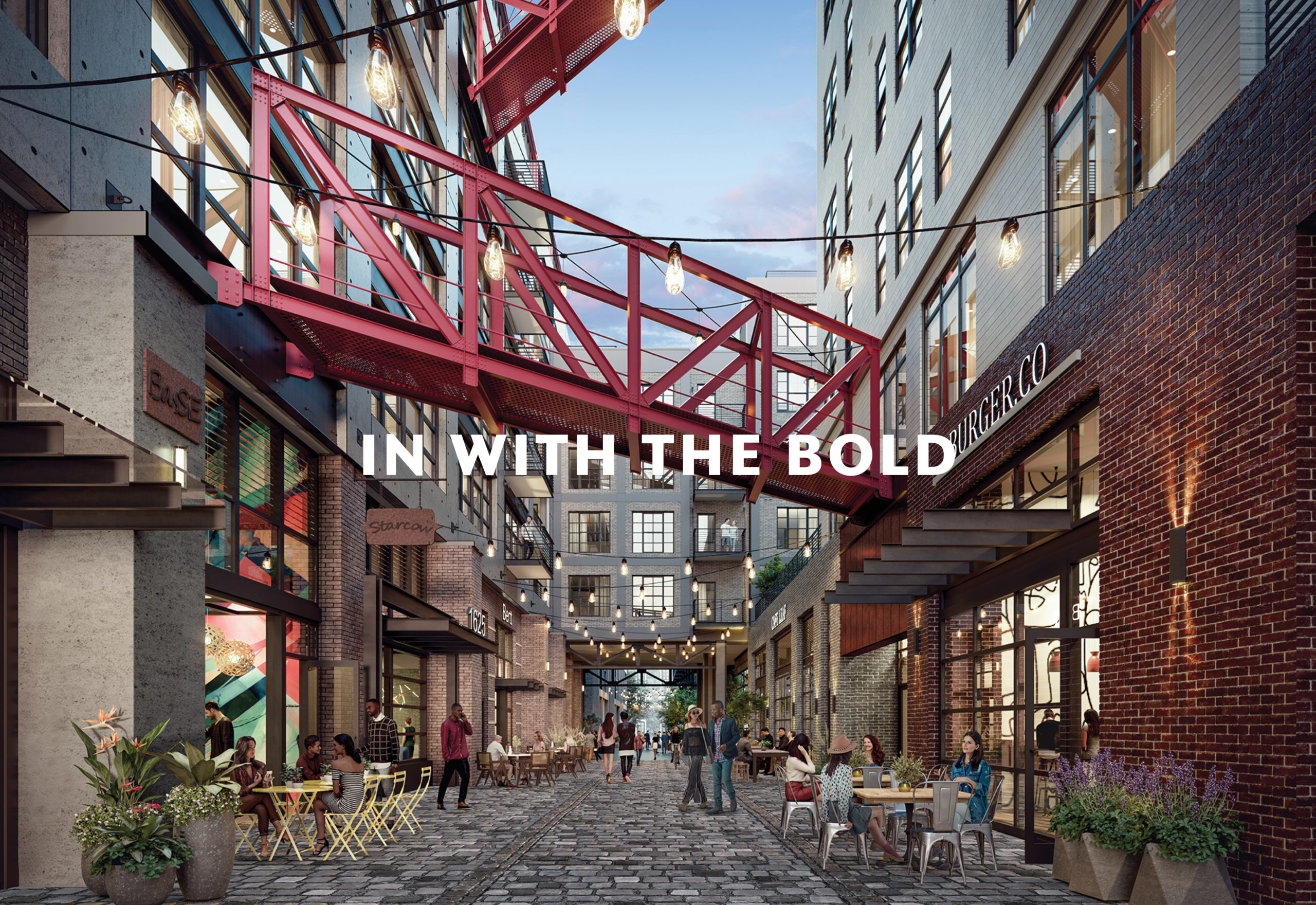
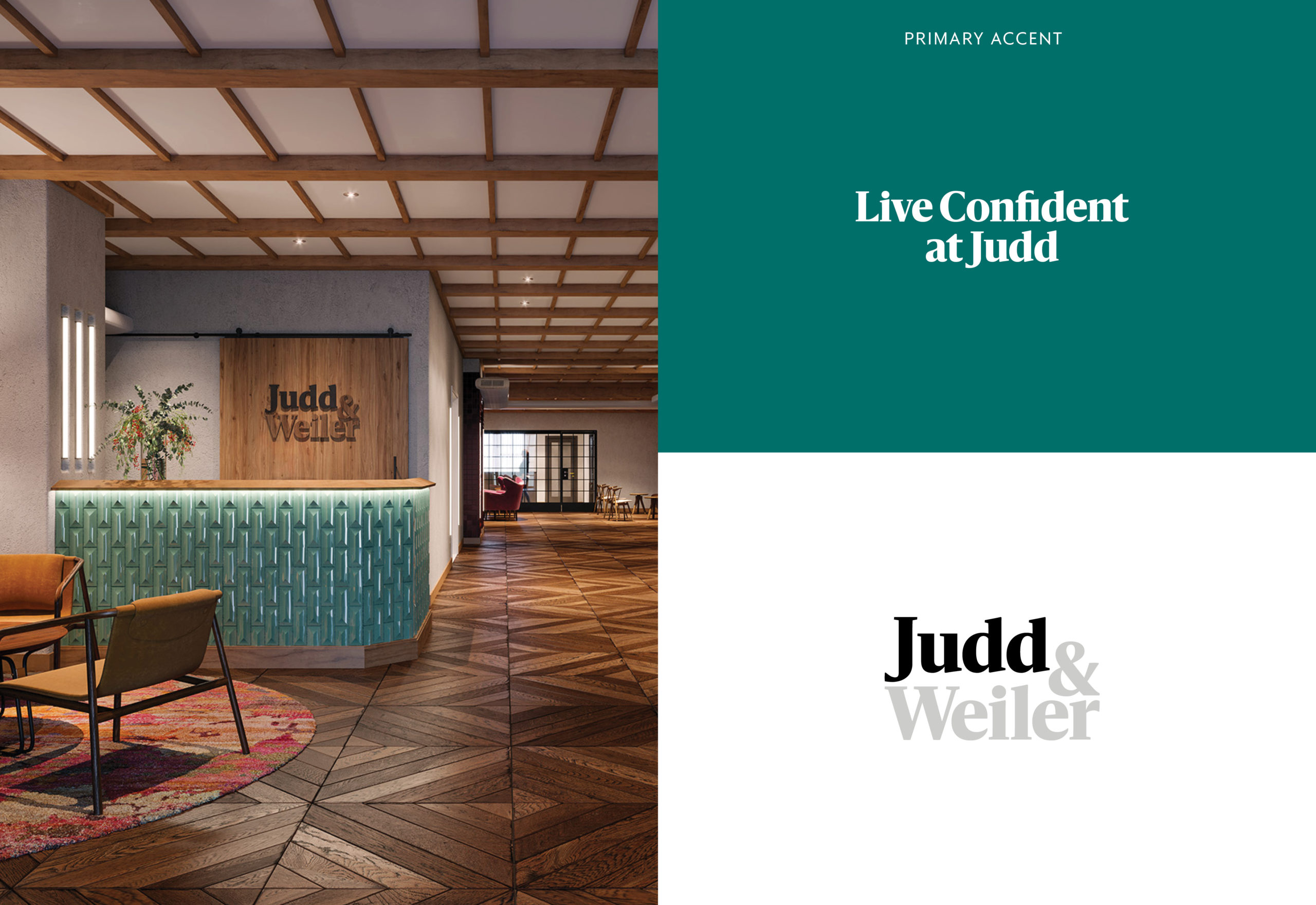
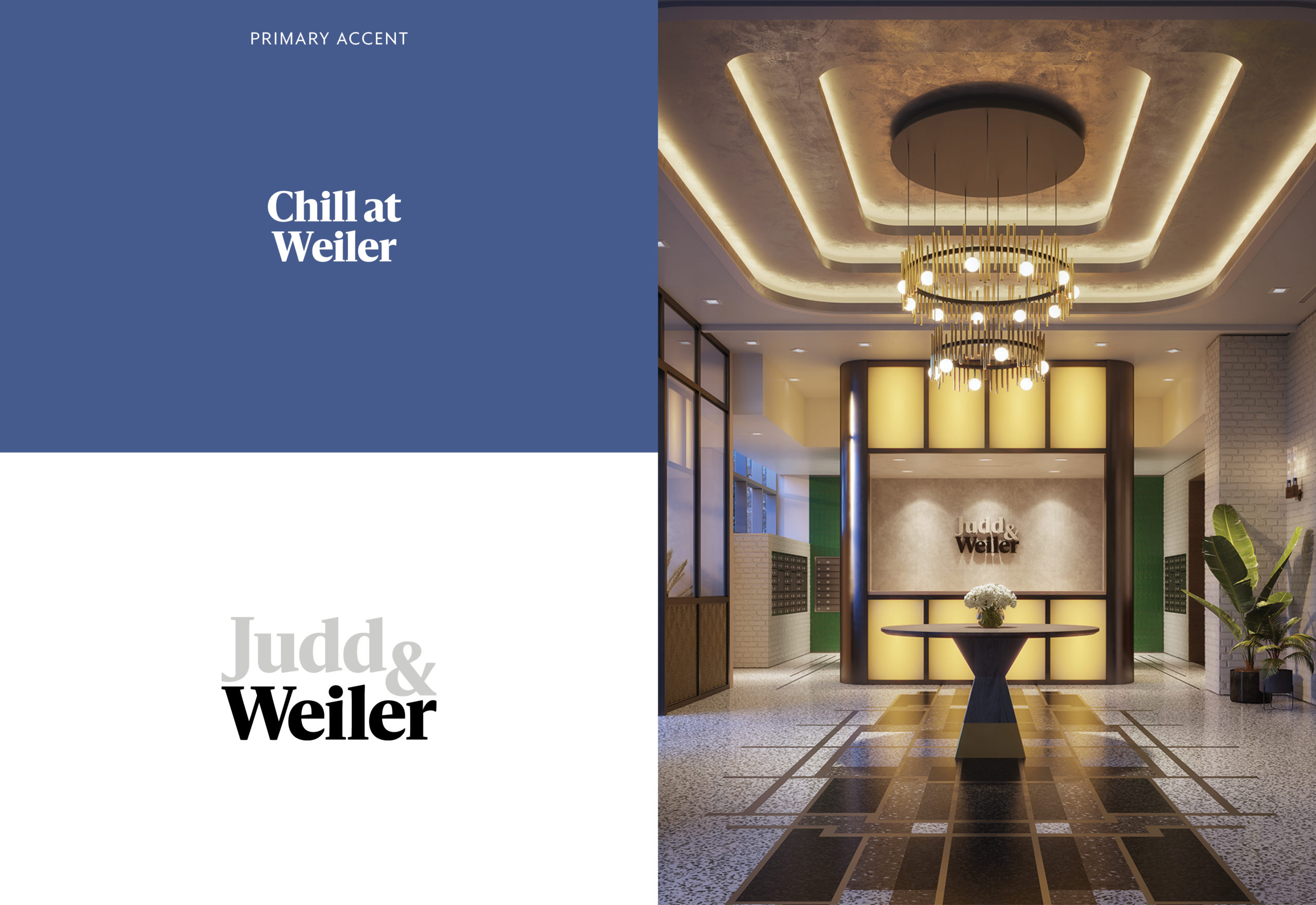
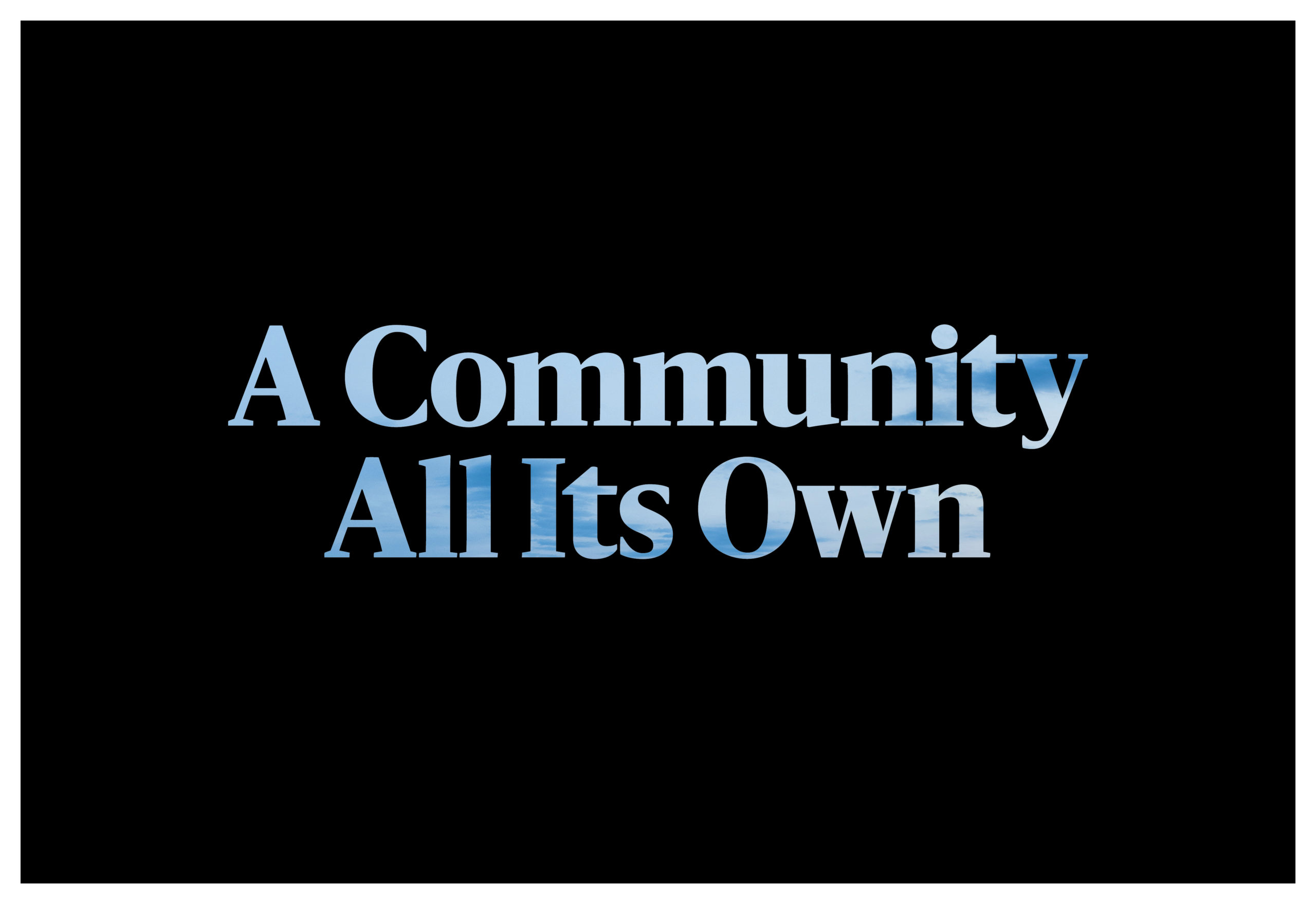
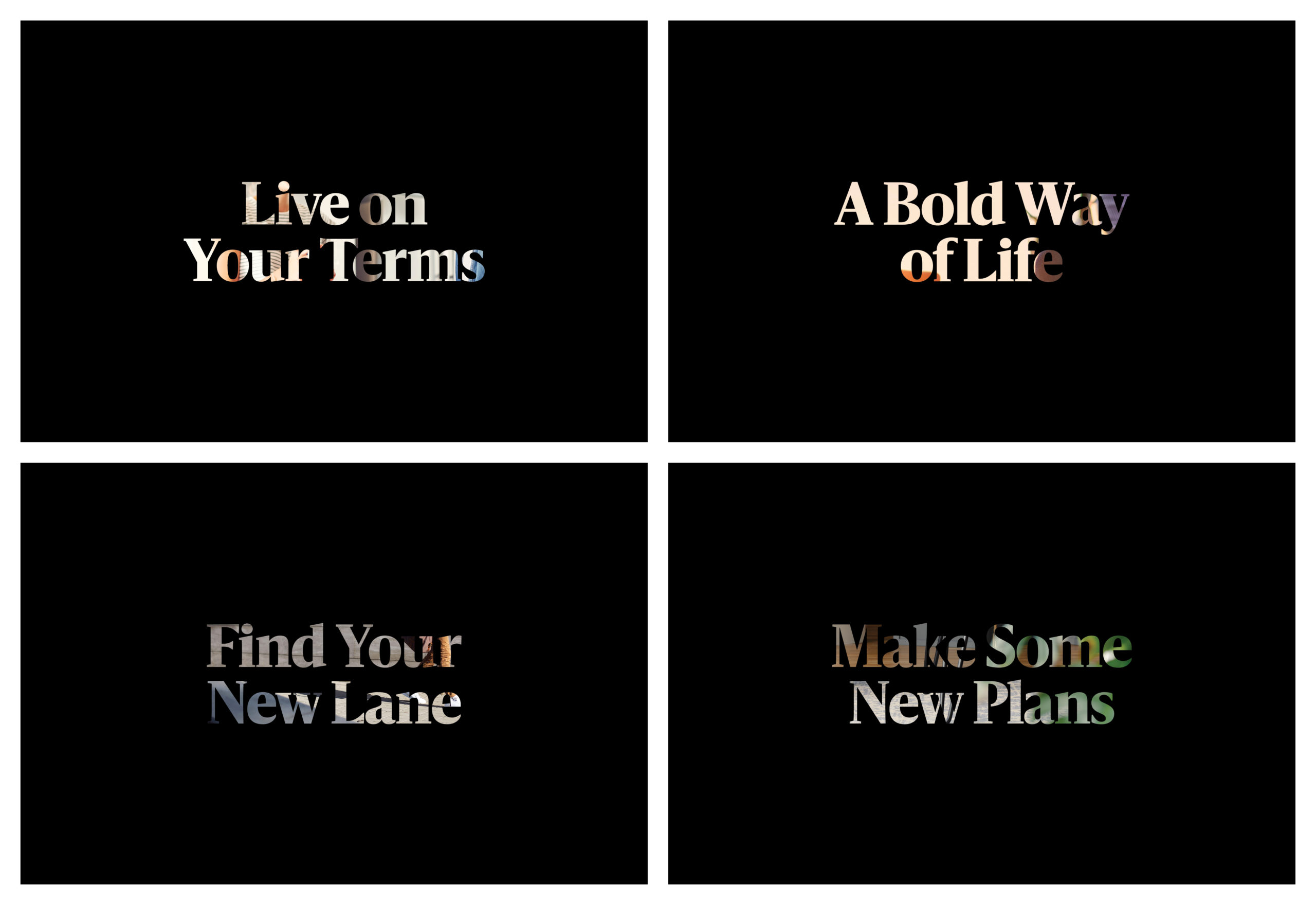
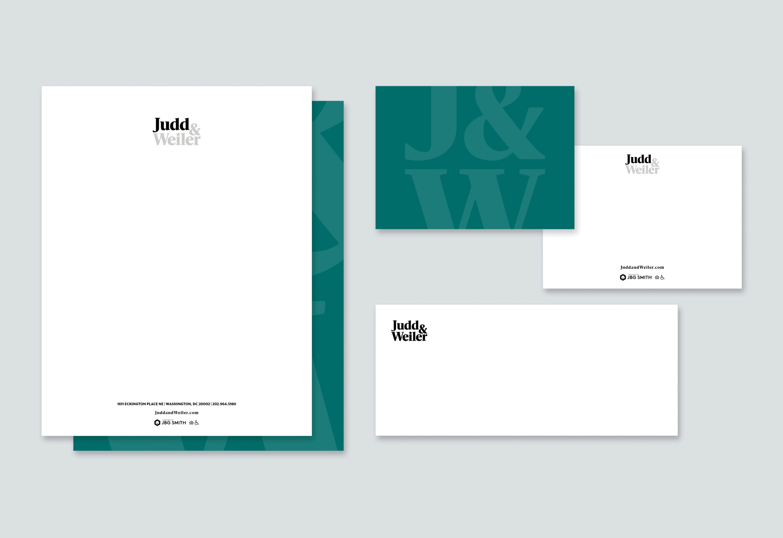
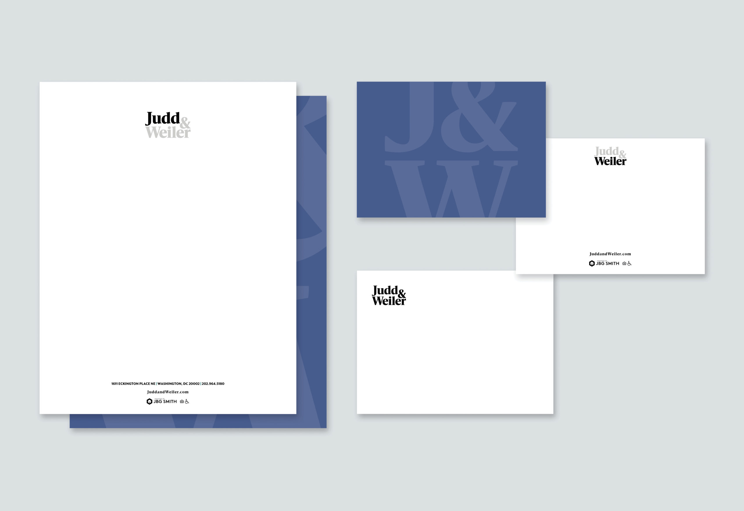
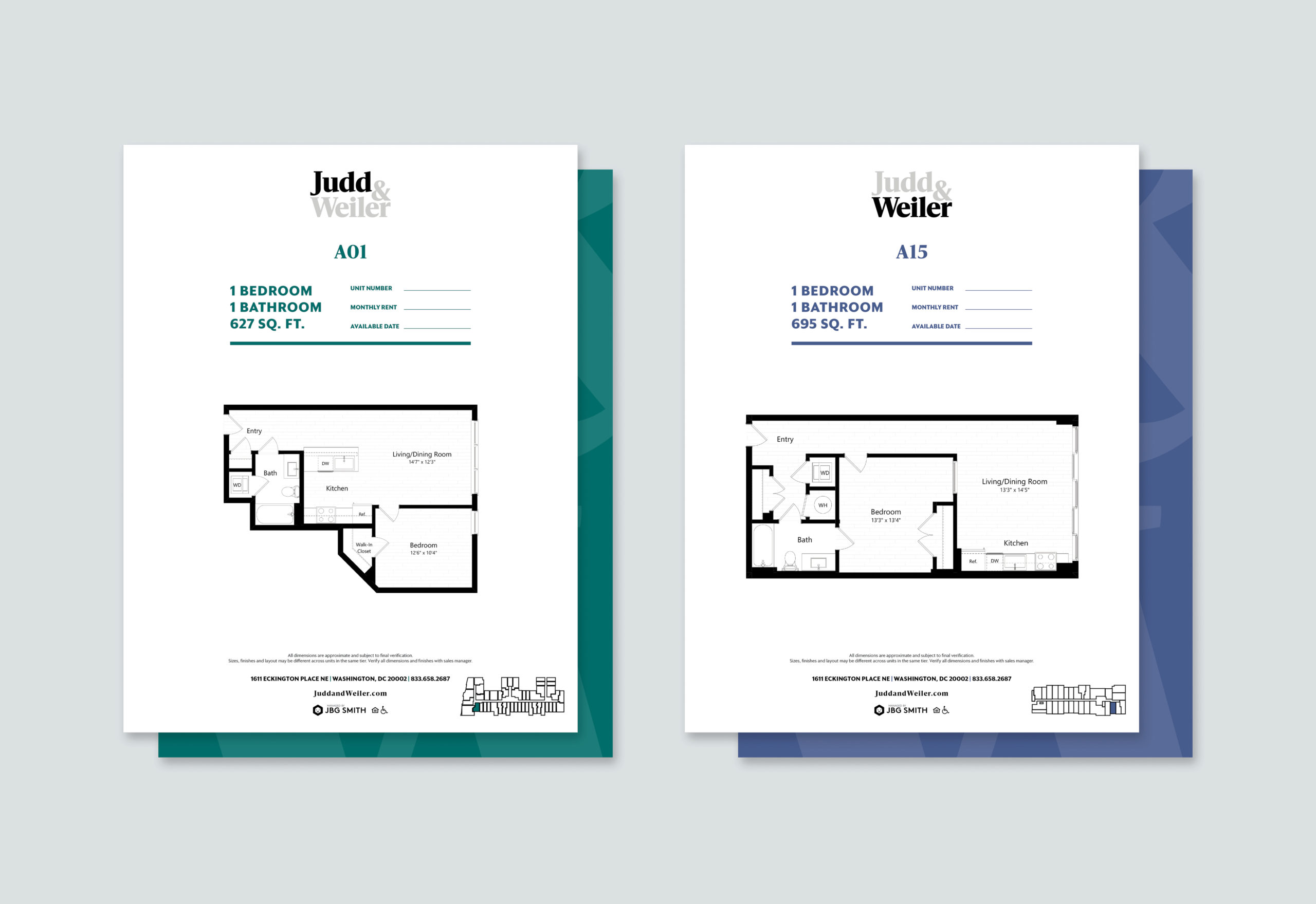
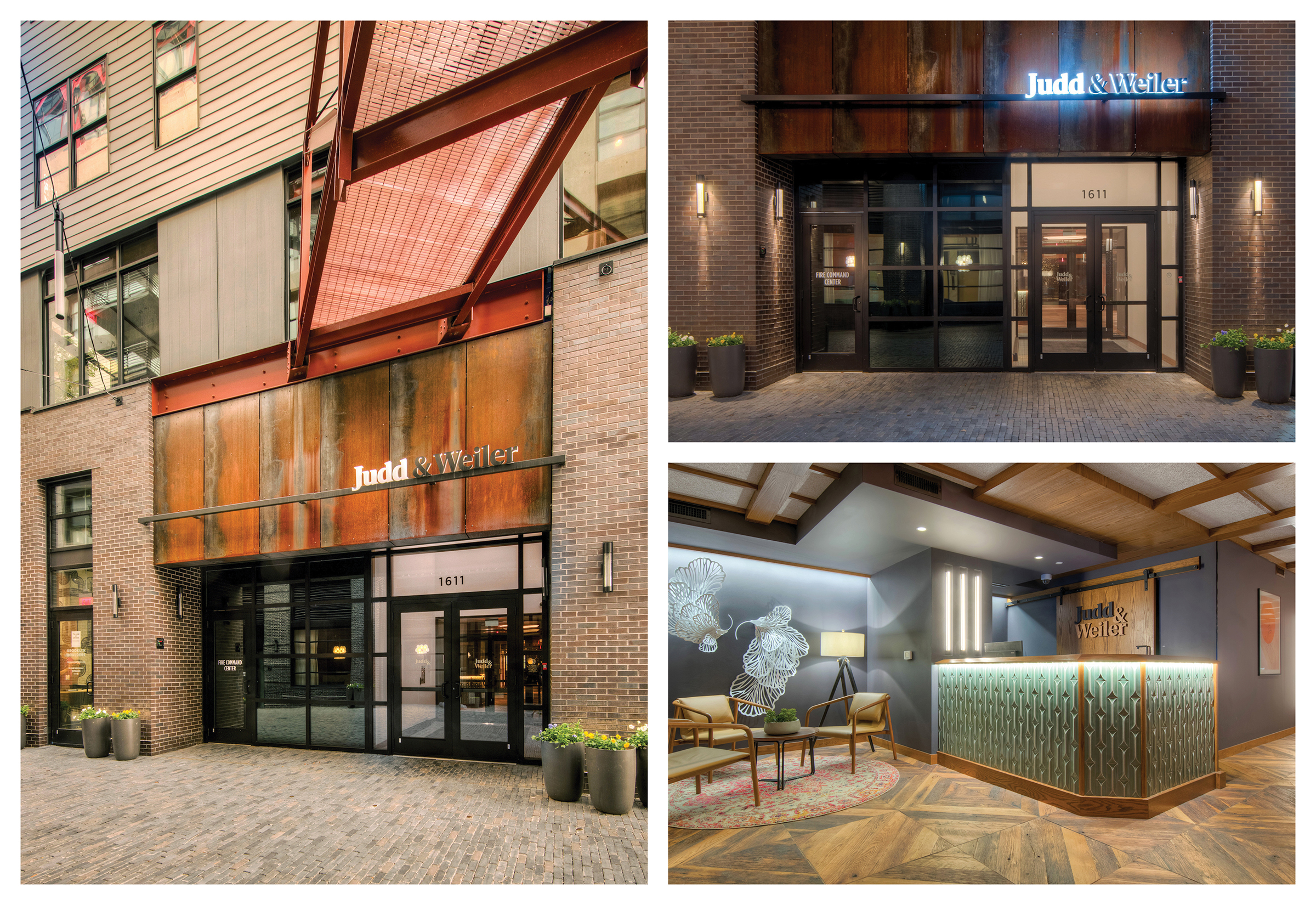
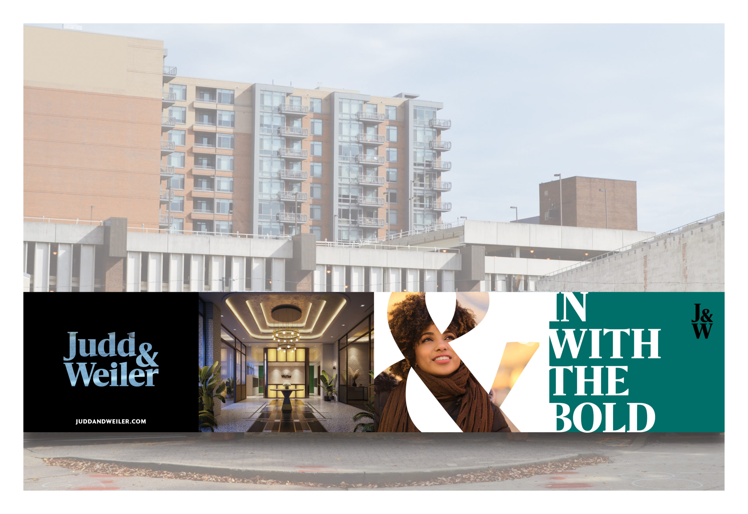
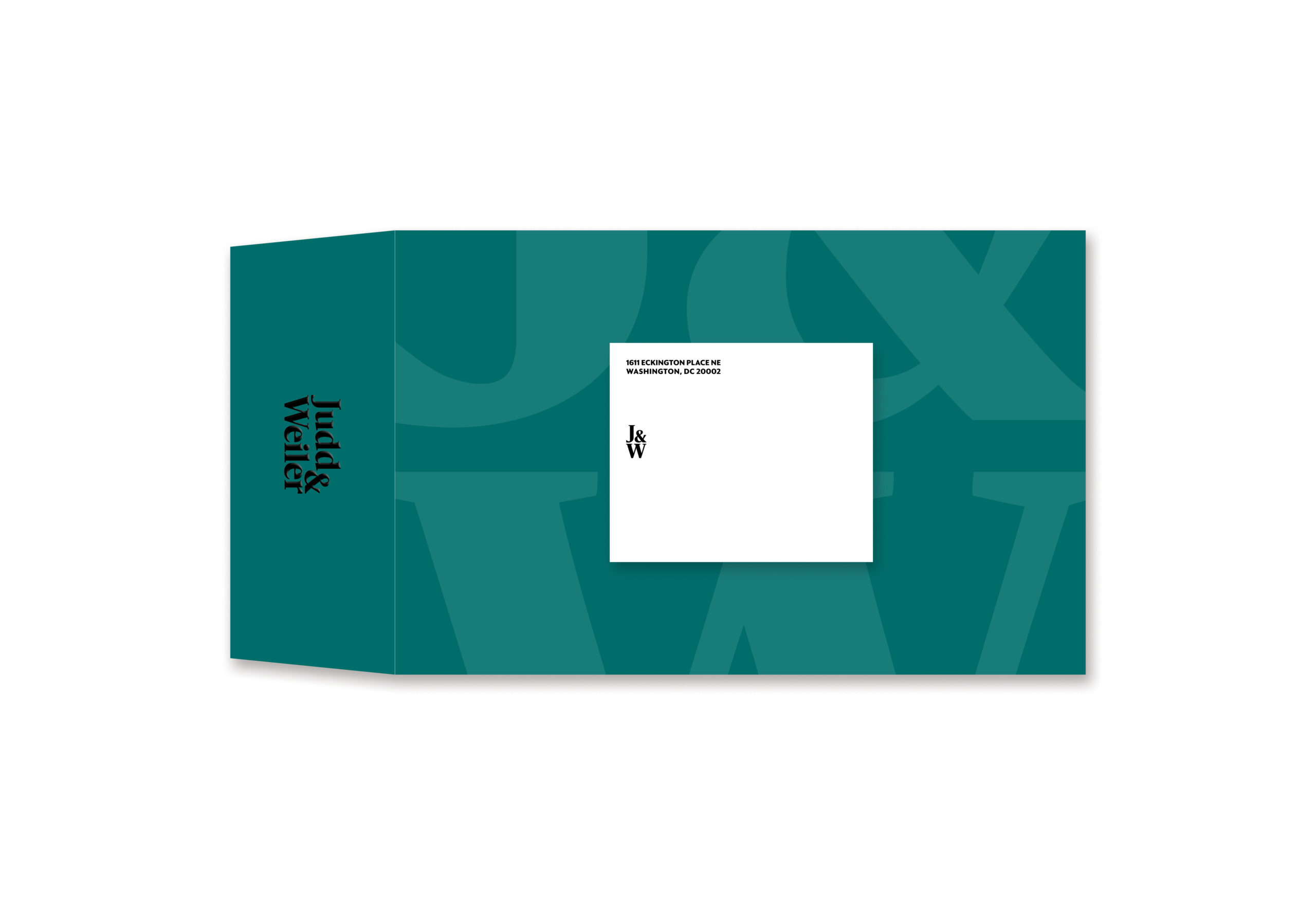
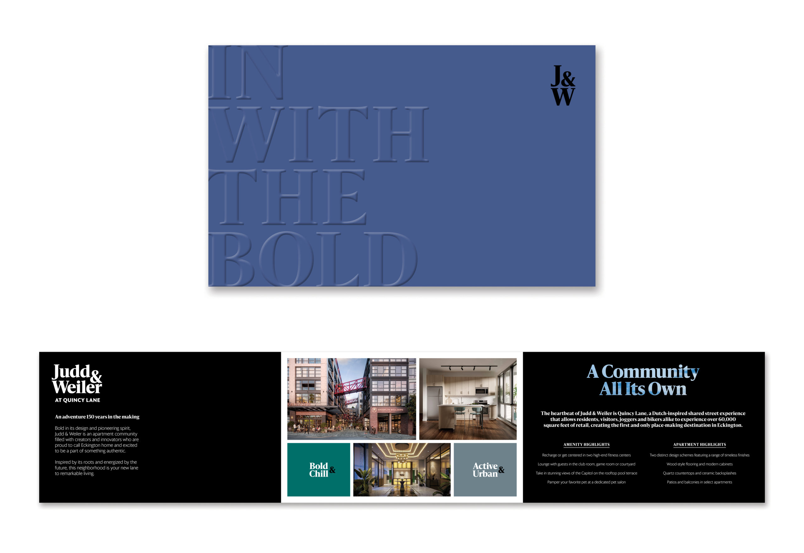
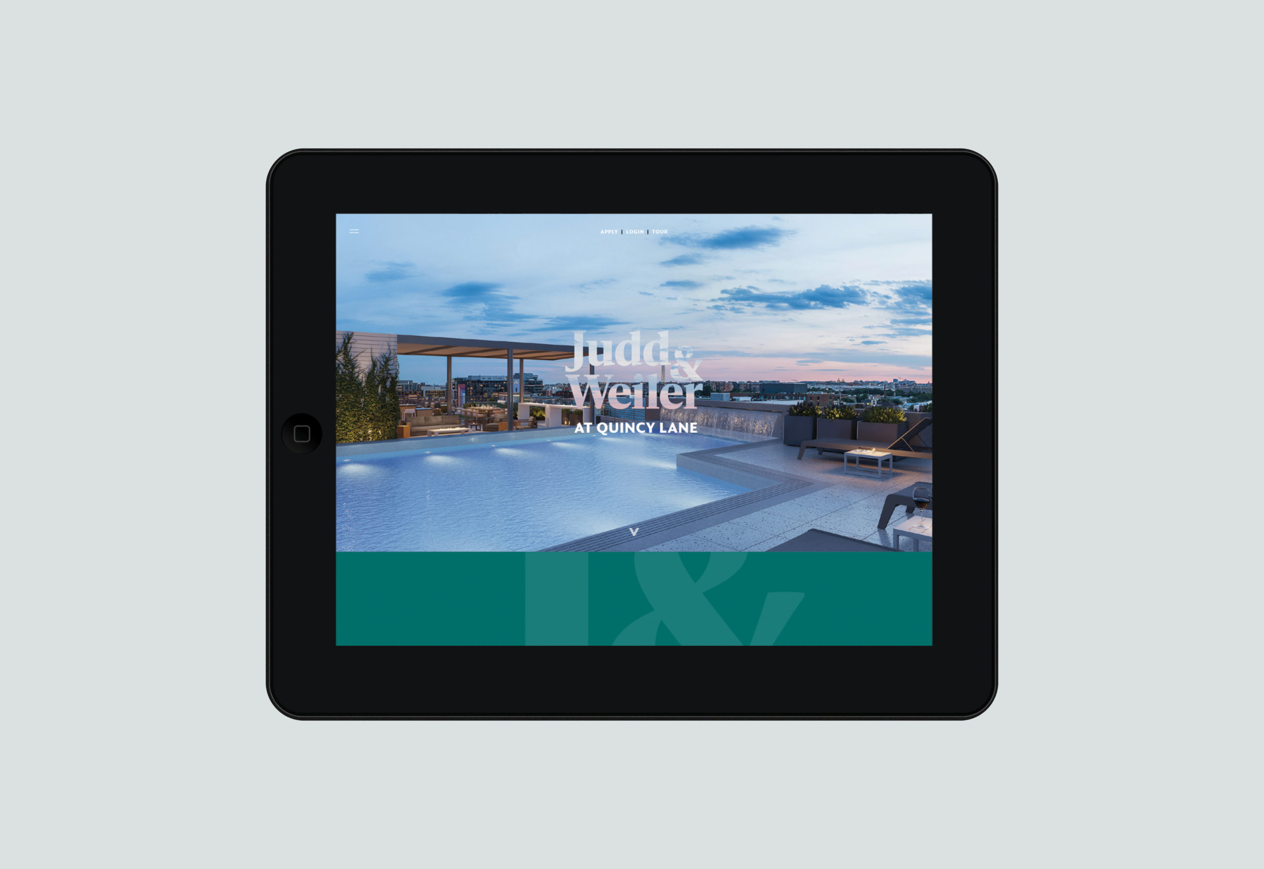
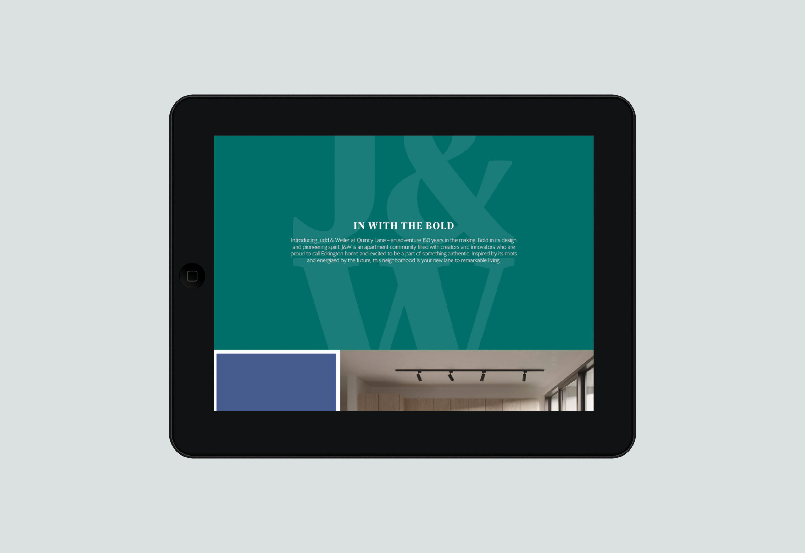
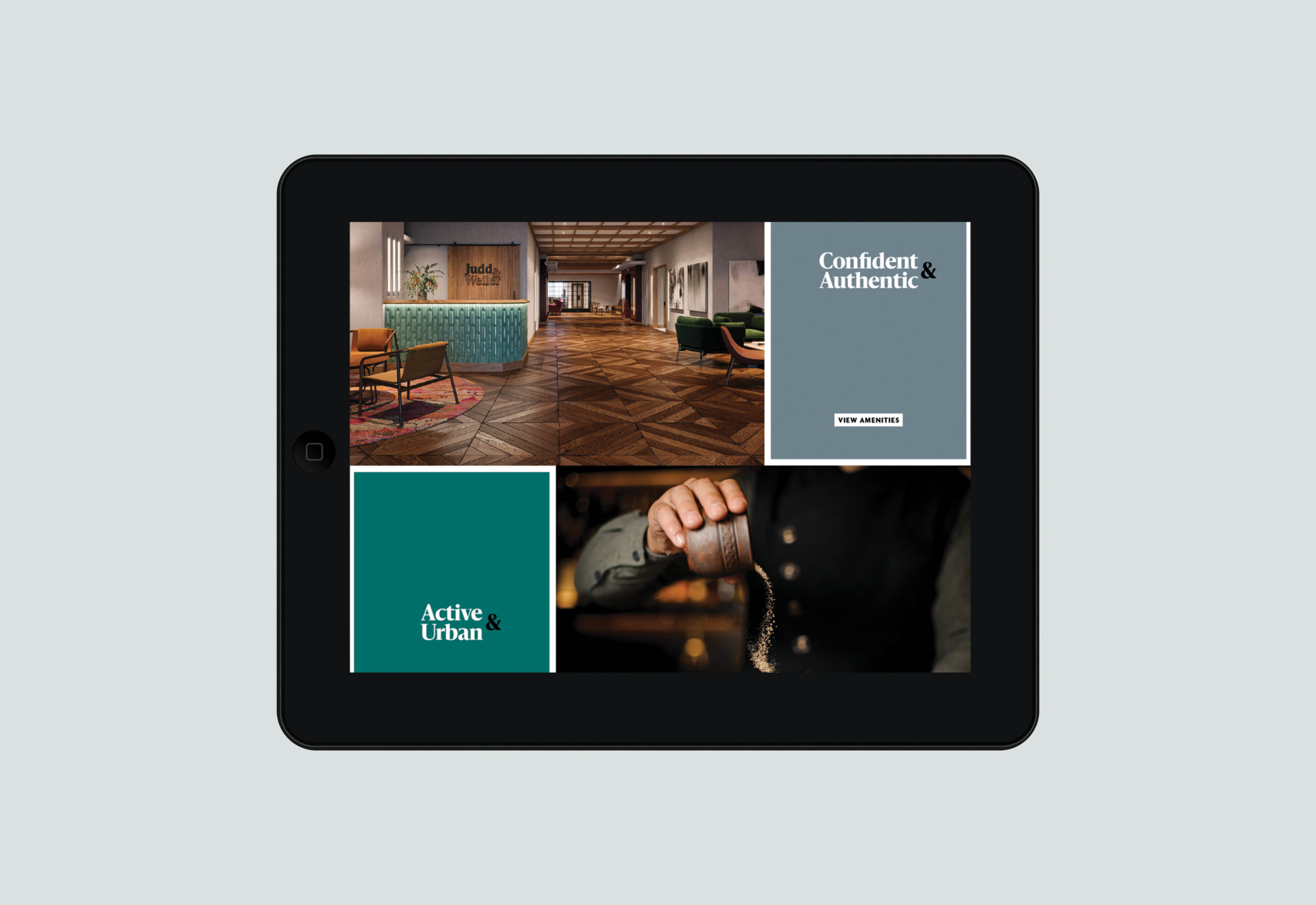
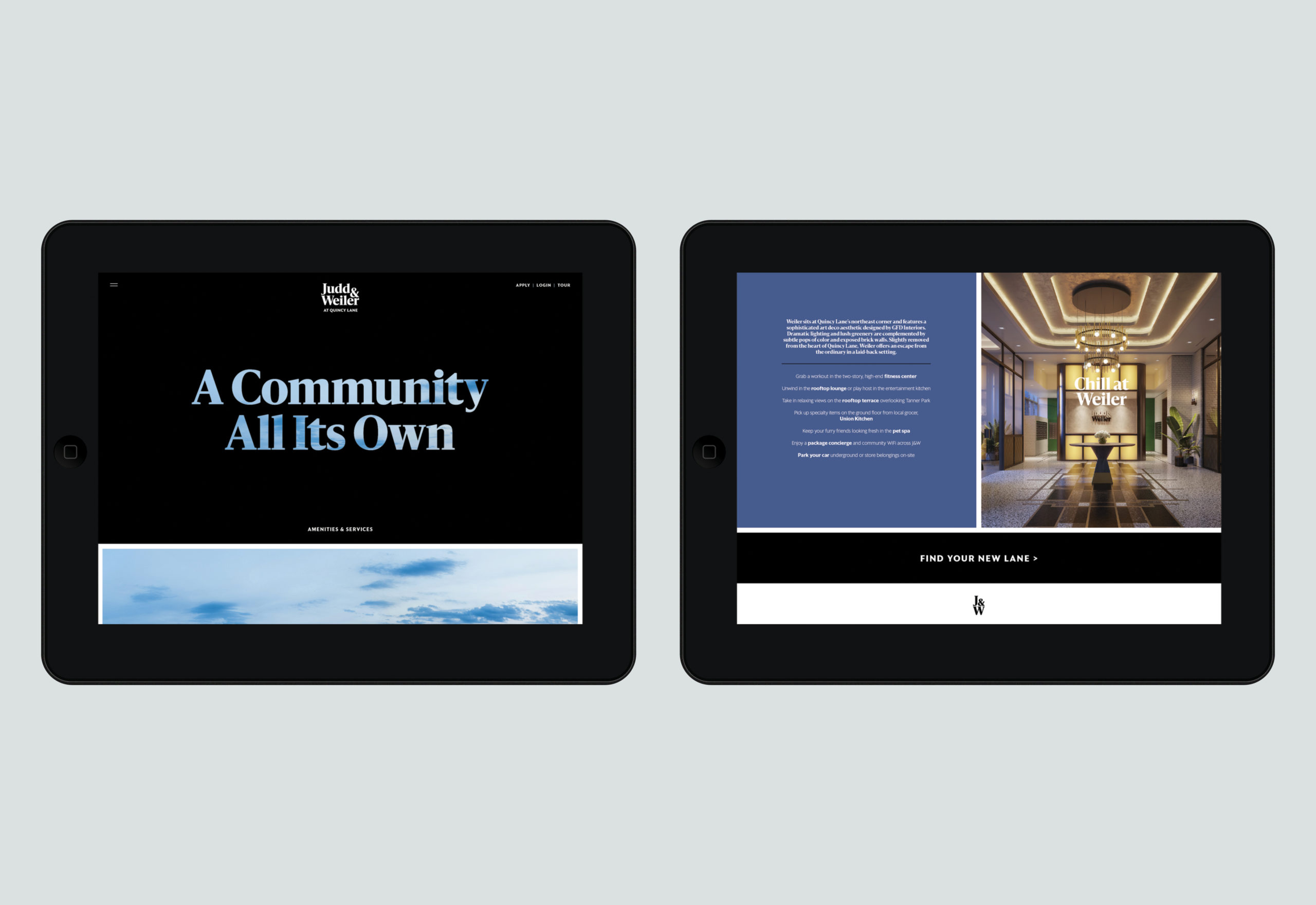
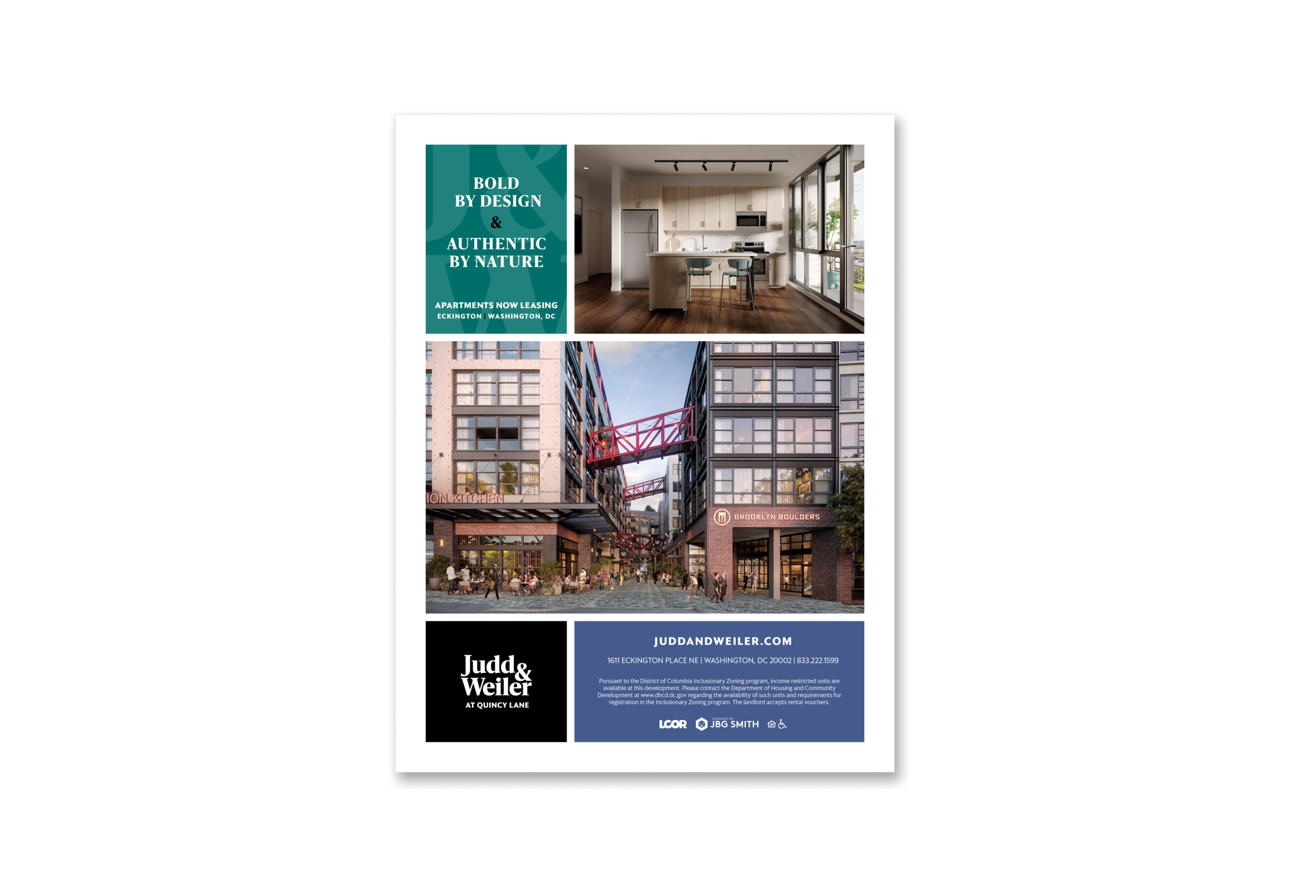
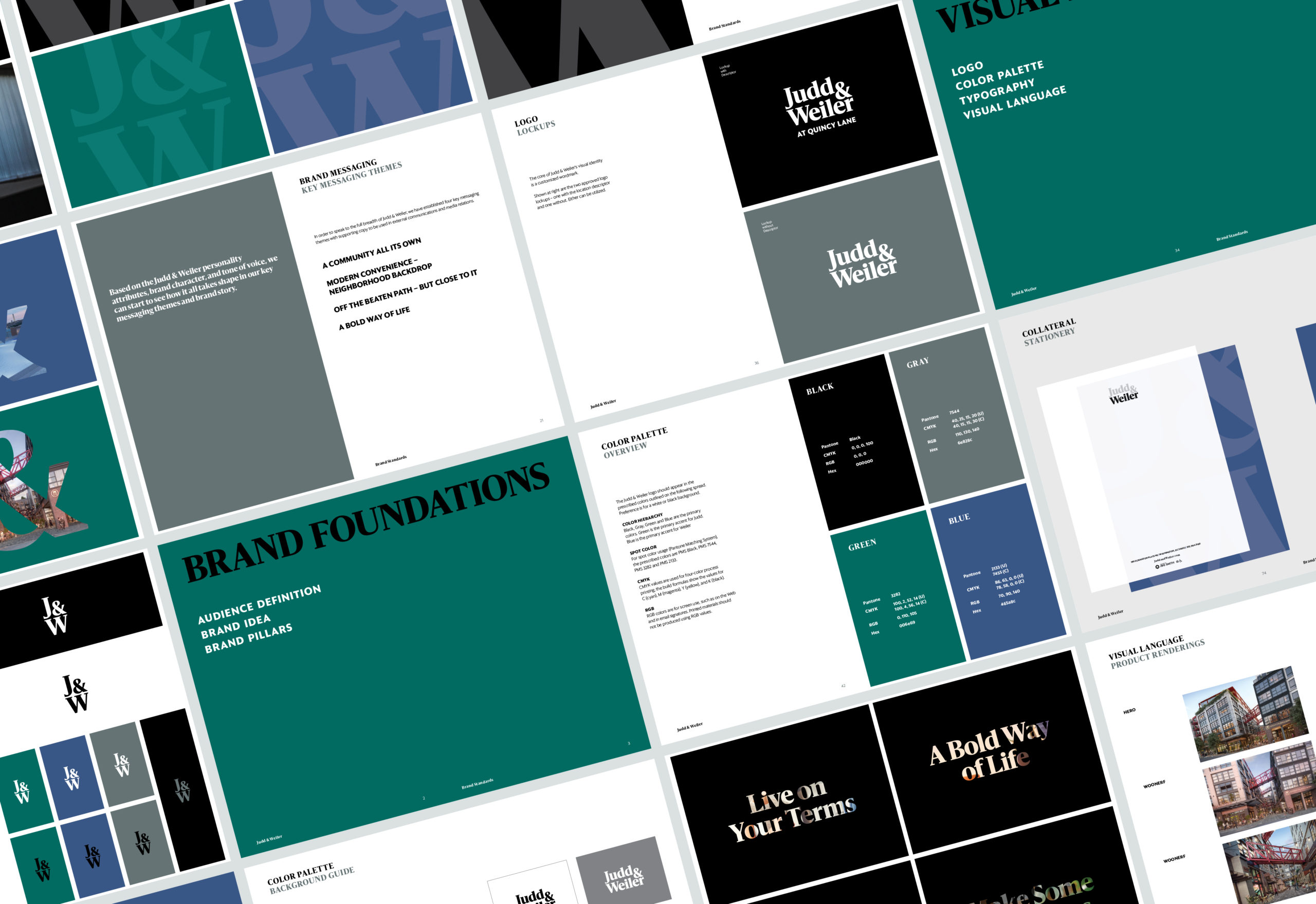
Introducing Judd & Weiler at Quincy Lane – an adventure 150 years in the making. Our discovery and immersion with developers, JBG Smith and LCOR, identified two strategic marketing opportunities: 1) we could be bold, authentic and restrained – where others had not to date; and 2) this was a rare destination-making opportunity with place-making residential and retail that had transformative potential to shape Eckington while maintaining neighborhood appeal. The graphic identity features a bold, typographic approach, stripped of any pretense and includes multiple wordmarks and a custom monogram. Creative printing techniques inspired by the ingenuity and craftsmanship of J&W’s pioneering namesakes are utilized throughout the campaign, while jewel tones add warmth to an unapologetic black-and-white palette. The visual language introduces logo supergraphic and messaging container systems that add depth, confidence and grit. Copy is direct but always welcoming, including such word plays as “in with the bold” and “confident by design.”
- CLIENT: JBG Smith
- PROJECT: Judd & Weiler Brand Campaign
- WEBSITE: juddandweiler.com
